Thursday, May 5, 2011
Kitchen Object Sketch
This is one of my last sketches of the semester. The overall sketch from the composition of the objects to the techniques used show what I have learned about sketching this semester. I chose the coffee, coffee mug, spoon, and cell phone because these are all everyday items that are found grouped together in kitchens. The world today moves fast and with few breaks. These items epitomize this recent phenomenon. I employed shading techniques like crosshatching and parallel strokes. My favorite part of the sketch is the reflection of the spoon and coffee mug in the cell phone's screen.
Fruit Cross-Section Sketch
This was one of my favorite sketches because it demonstrates many of the skills that I had learned in doing the previous sketches. I varied the line weight to create some of the textures seen in the fruit and also to create a stronger sense of value change since the sketch is gray scale. Also, I employed shading to show where the light was placed because of where the shadows and highlights lay. Finally, I used shading to emphasize certain parts of the fruit such as imperfections in the fruit like discoloration.
Black Paper Sketch
In doing this sketch I have learned a lot. The first step was to decide what type of fixture to sketch. I decided to sketch a window lock fixture because when looking at the linear features of the window it stands out. After the fixture was sketched I had to decide which colors to use highlight the fixture. The first time I turned in the sketch it was returned because there was not enough color used. Then I added
as many colors as I could even placing unusual color combinations together. This change made the sketch much stronger.
Wednesday, May 4, 2011
Sketchbook Covers
 |
To create my sketchbook cover I experimented with a few different covers. First, I tried to create a tree with branches flowing over the top leaving an opening for the title block. However, the drawing was not strong enough and did not carry the amount of presence I was looking for. Then, I explored a few covers that used both two dimensional and three dimensional features. I decided on this final cover because the circles on the front were varied and used many different layers developing an interesting design. The design was strong but at the same time did not take away from the sketches within the book. My reflection simply states a few of the things that I learned from creating this book including my strengths and weaknesses and new skills that I developed.
Wednesday, April 20, 2011
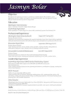
Resume
Wednesday, April 13, 2011
Logo
Friday, March 4, 2011
Lacuna
 |
Subscribe to:
Posts (Atom)


